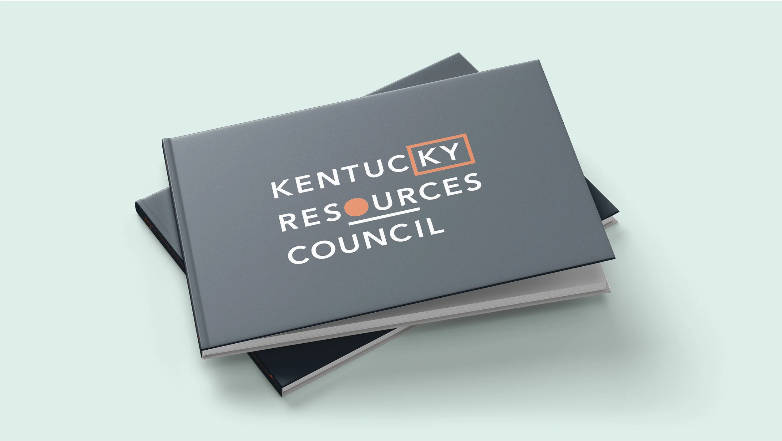
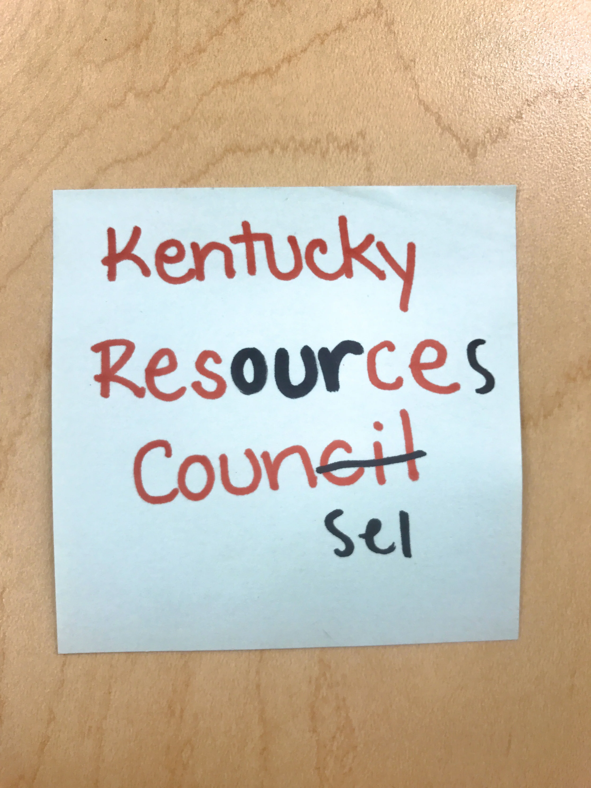
– KENTUCKY RESOURCES COUNCIL
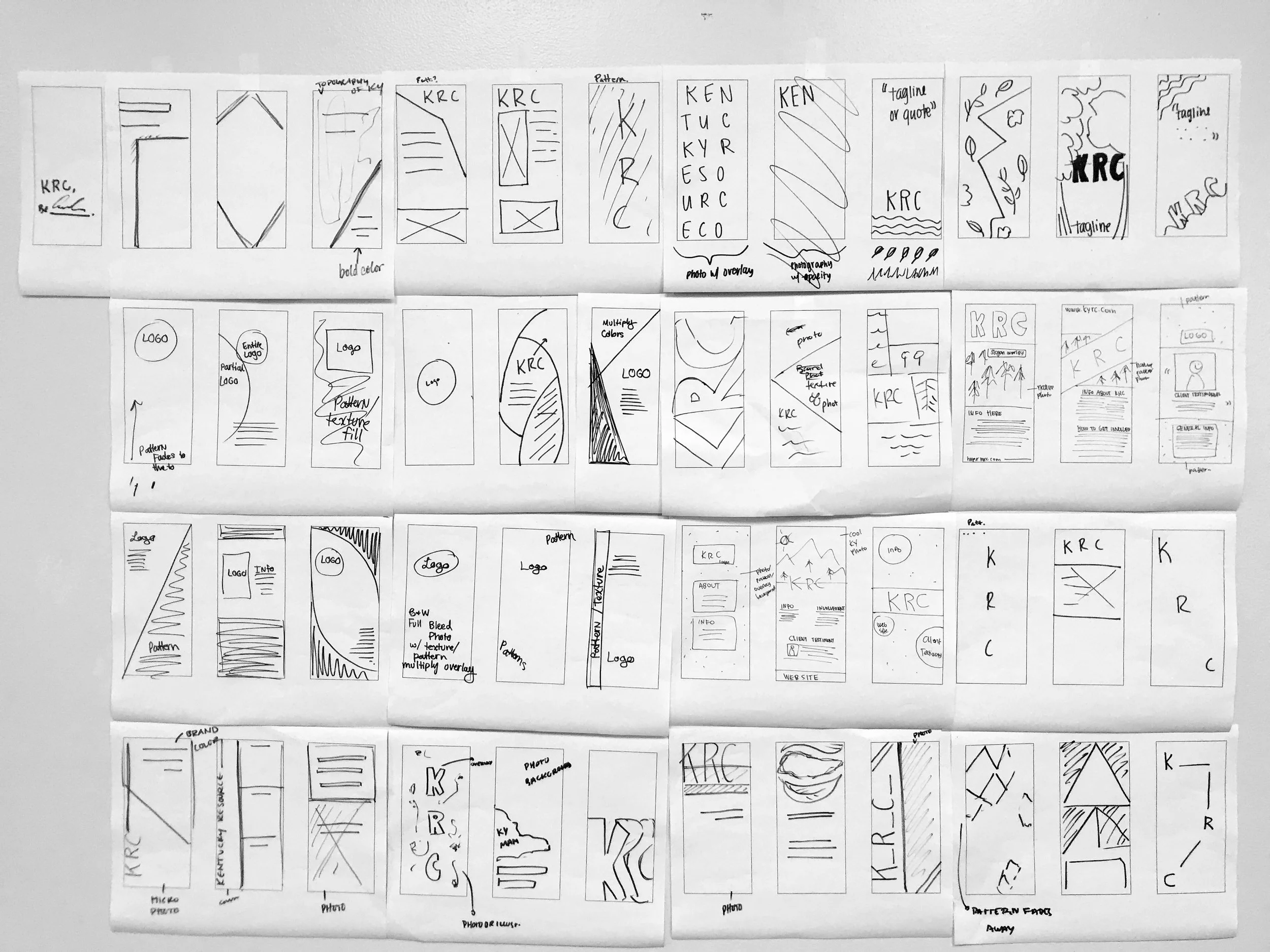
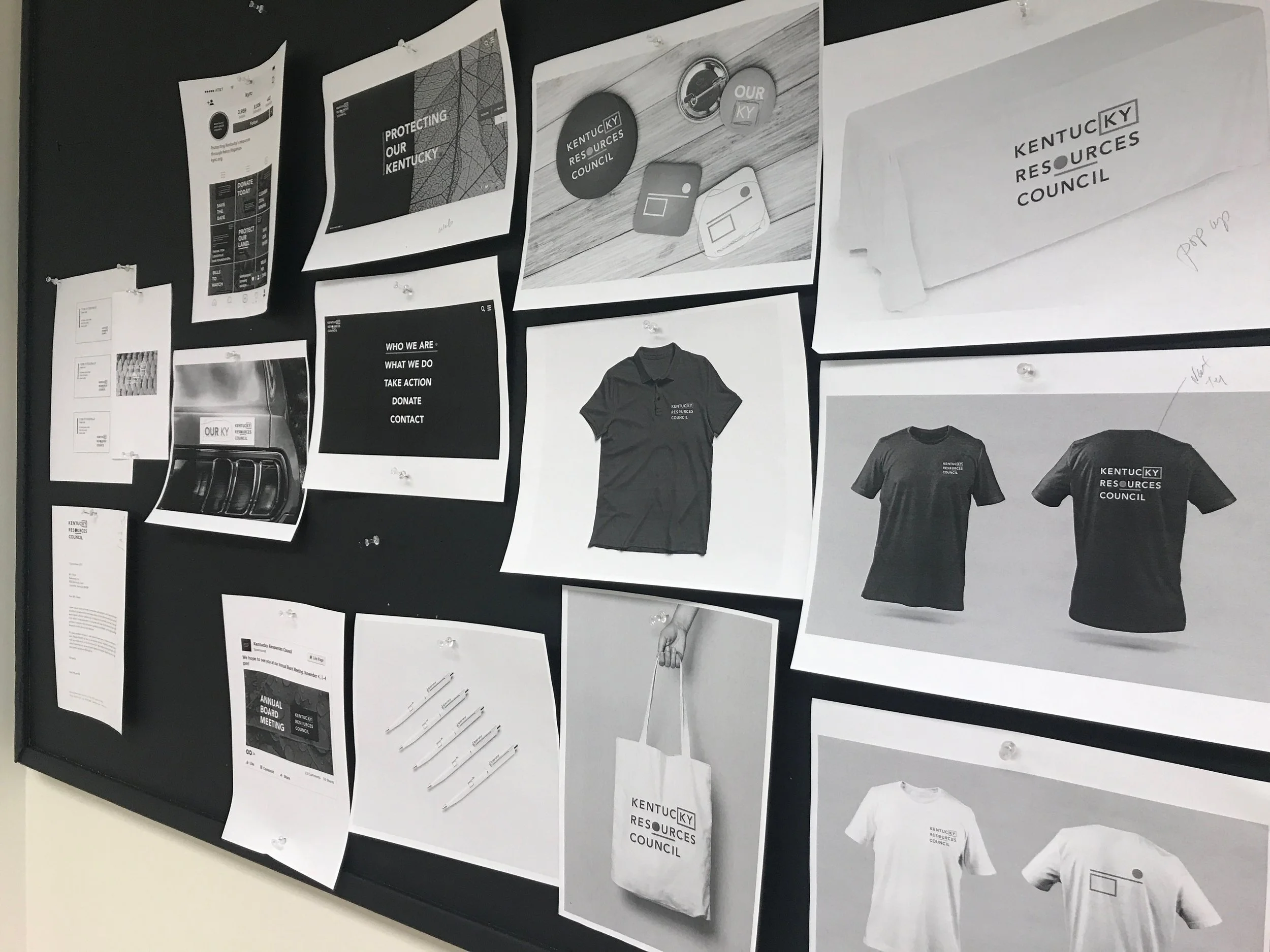
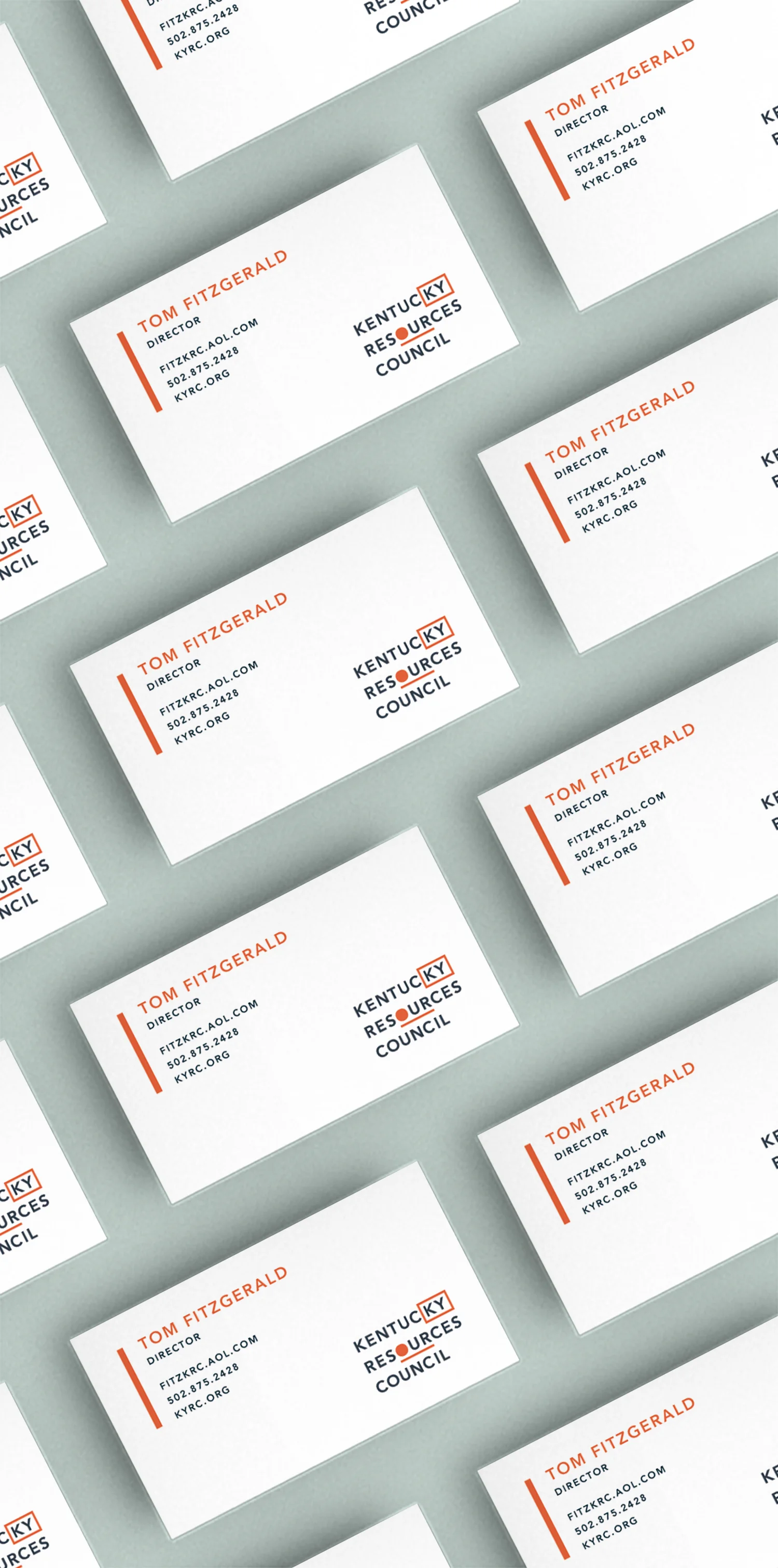
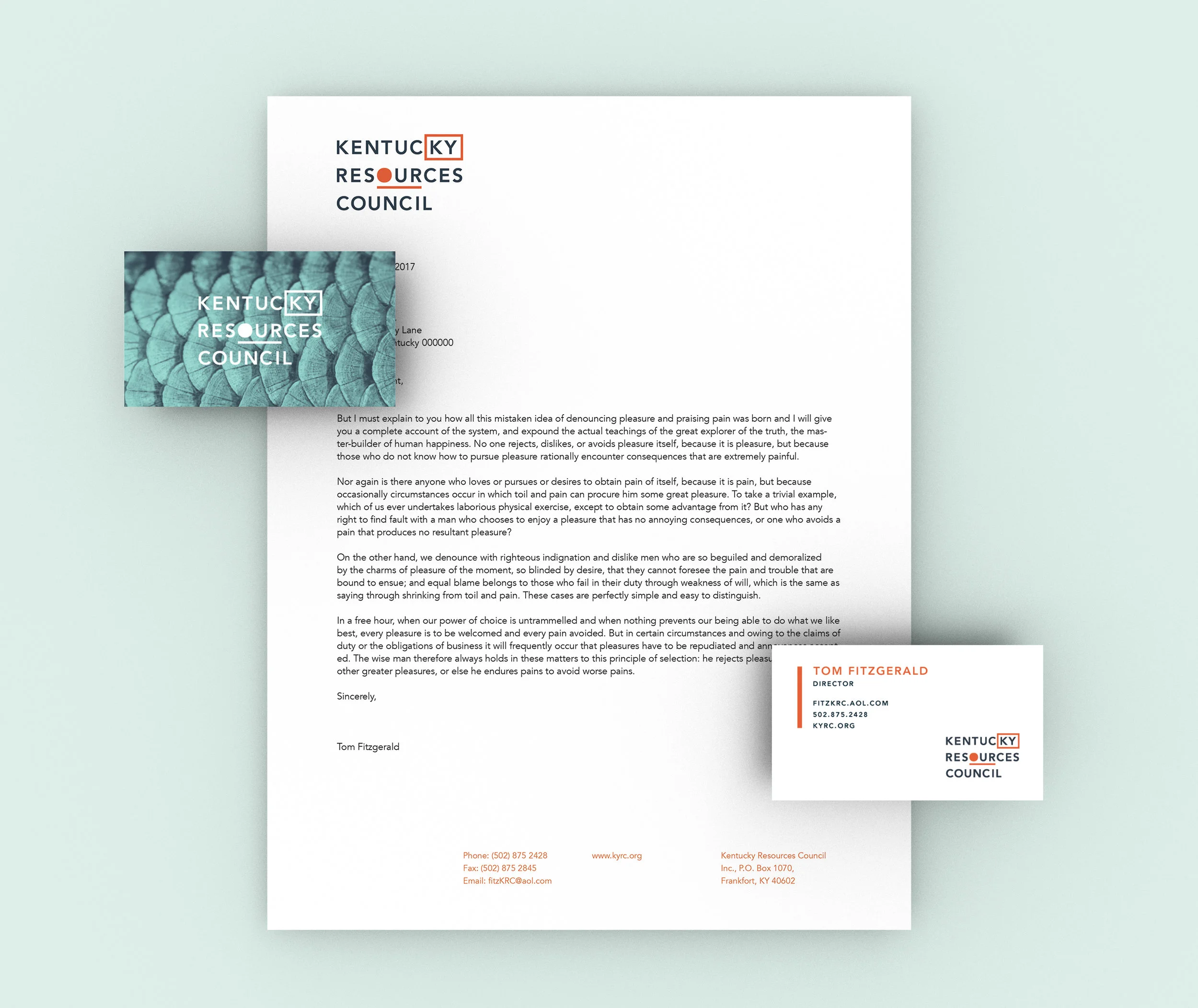
For this project, our team worked with a non–profit organization that needed rebranding. We did research on their audience and similar organizations to determine what would make them stand out among the rest. So we created two strong, but different, brand strategies for the organization to choose from. After selecting a direction with input, we refined the identity even further to make it into the brand shown.
UPDATING A BRAND THAT'S KEEPING US SAFE
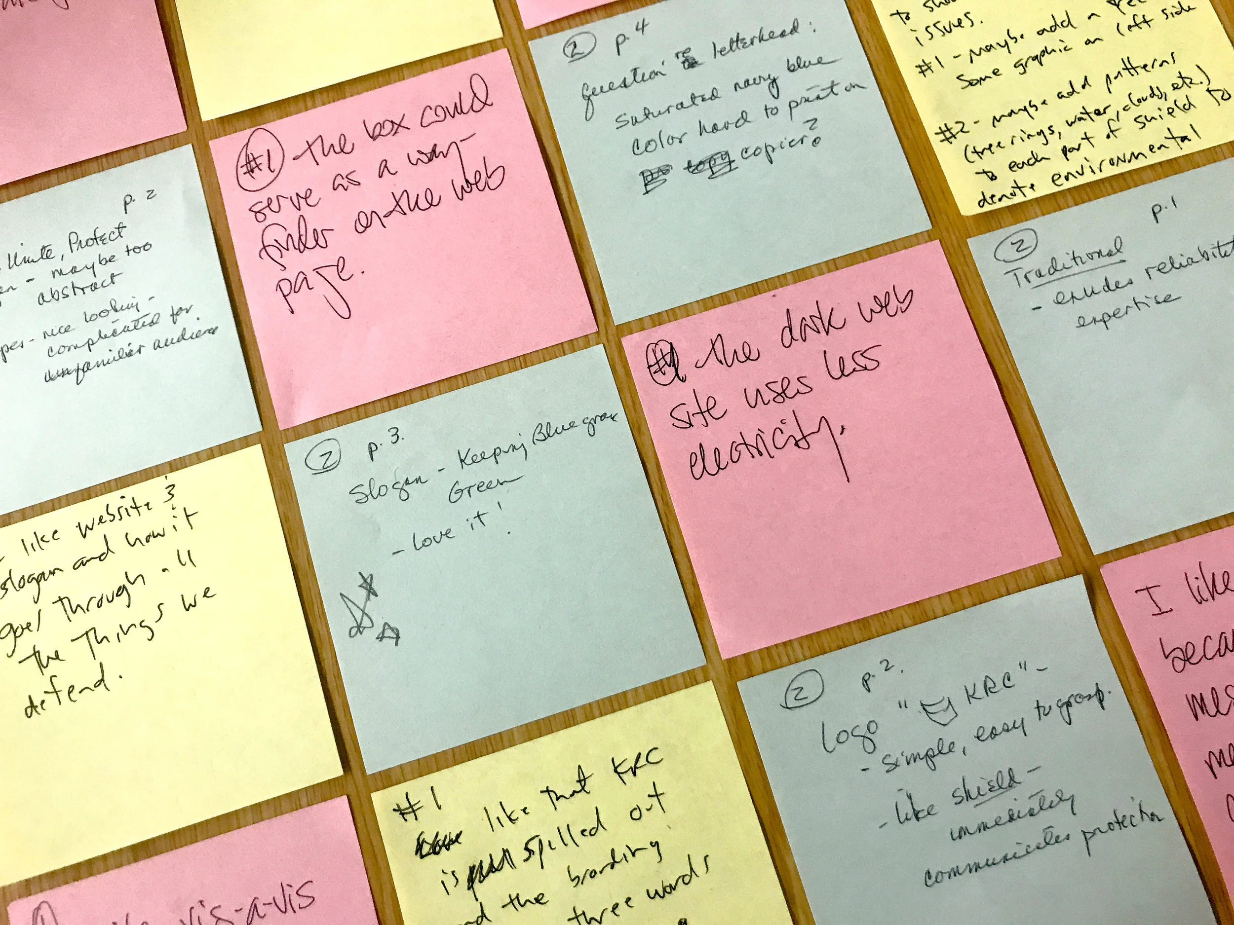
Upon completing the initial research, the team and I decided to create two unique looks. A modern but bold approach, and a more corporate, strong approach. After presenting both ideas, we decided that being bold was the best strategy for what the organization wanted to accomplish.
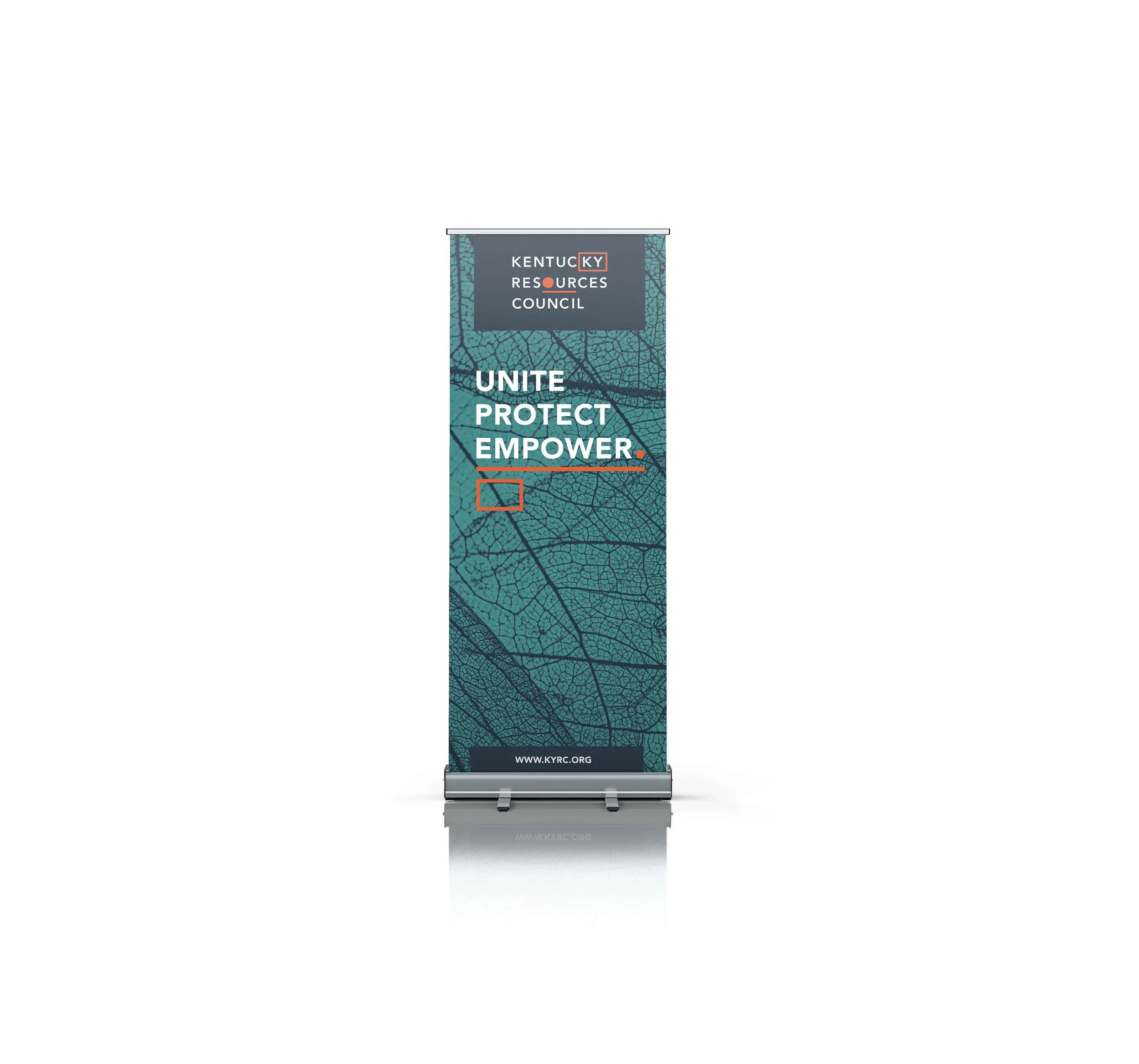
LET'S BE BOLD
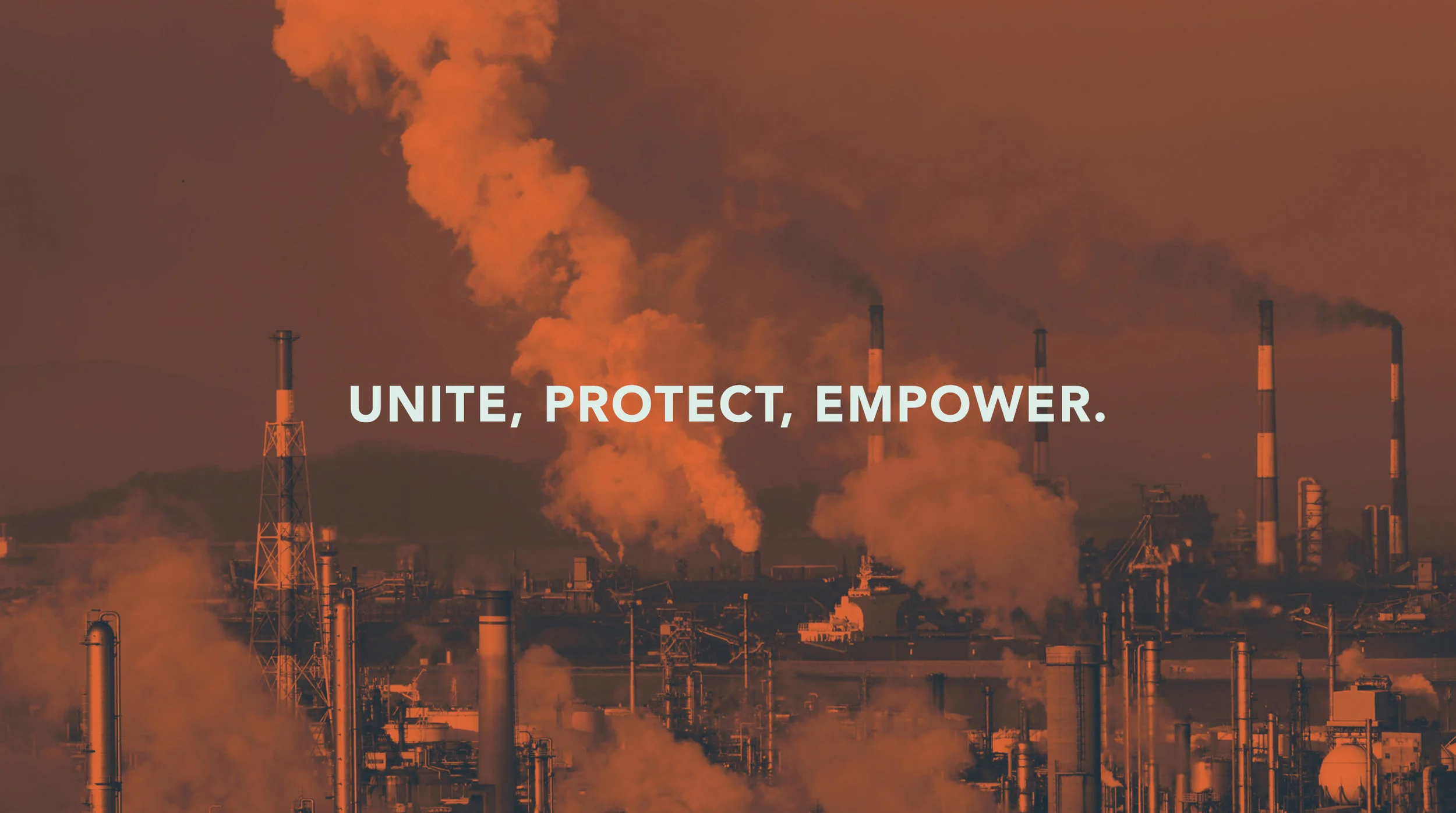
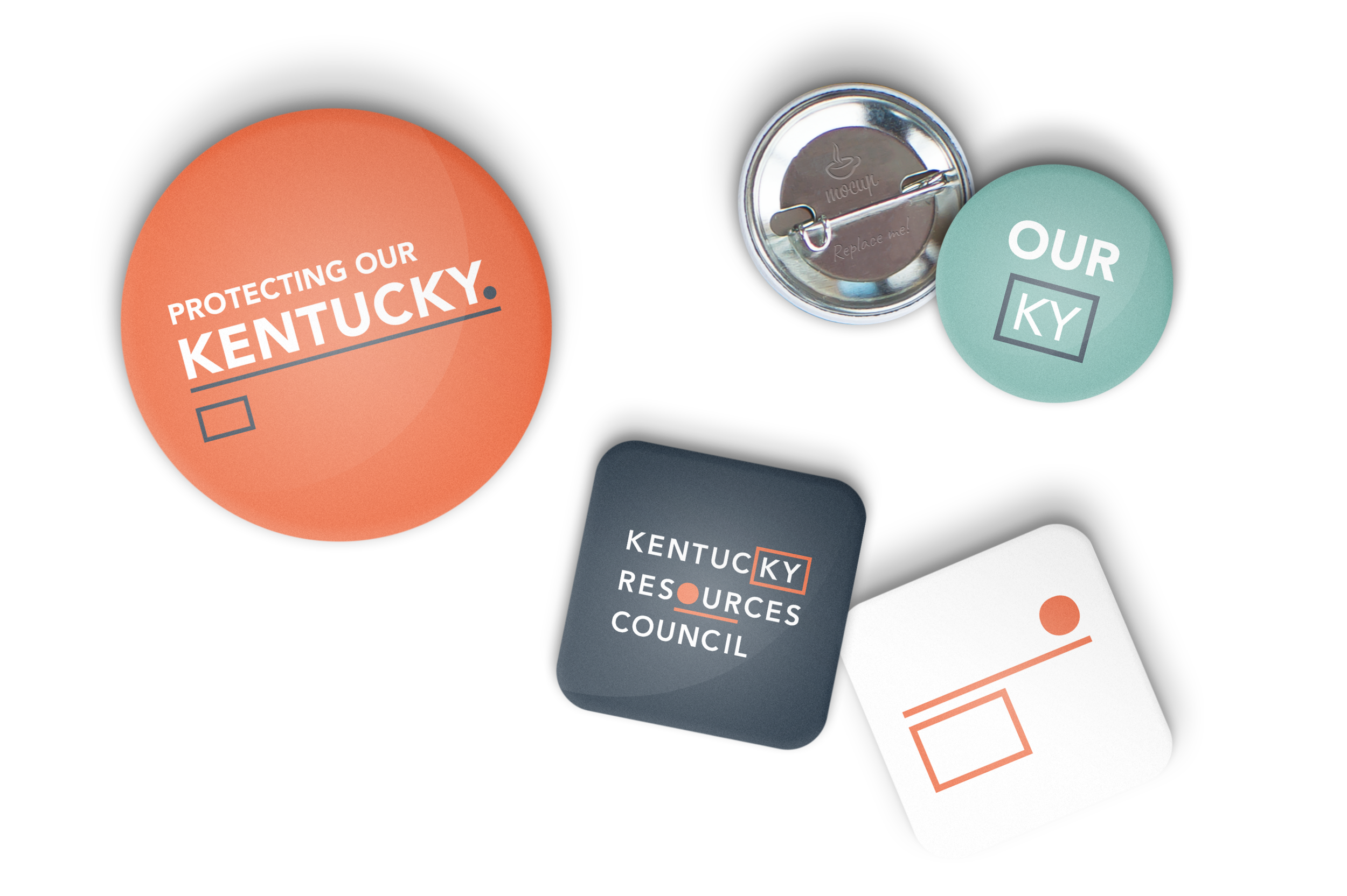
The entire redesign focuses on the slogan: Unite, Protect, Empower. This slogan directly relates to the new logo, where Unite refers to the underline of "our" in resources. Protect relates to the square around "KY," and Empower relates to the dot, signifying the individuals power.
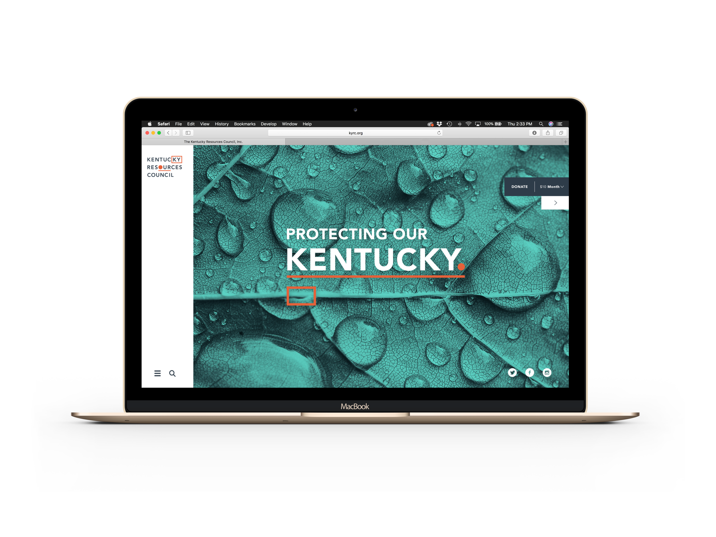
BRINGING AWARENESS INTO THE MODERN ERA.
To accomplish one of the clients main goals of the redesign, which was to engage a younger audience, we had to make them more accessible. We did this by recreating a brand new website layout, social media platforms, and creating their look with bold colors that grab someones attention from across a room.
Brand standards
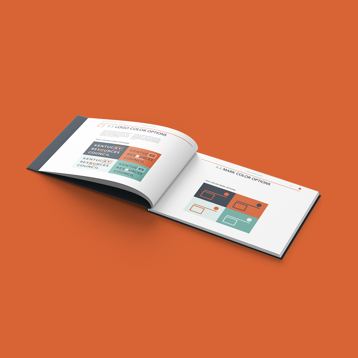
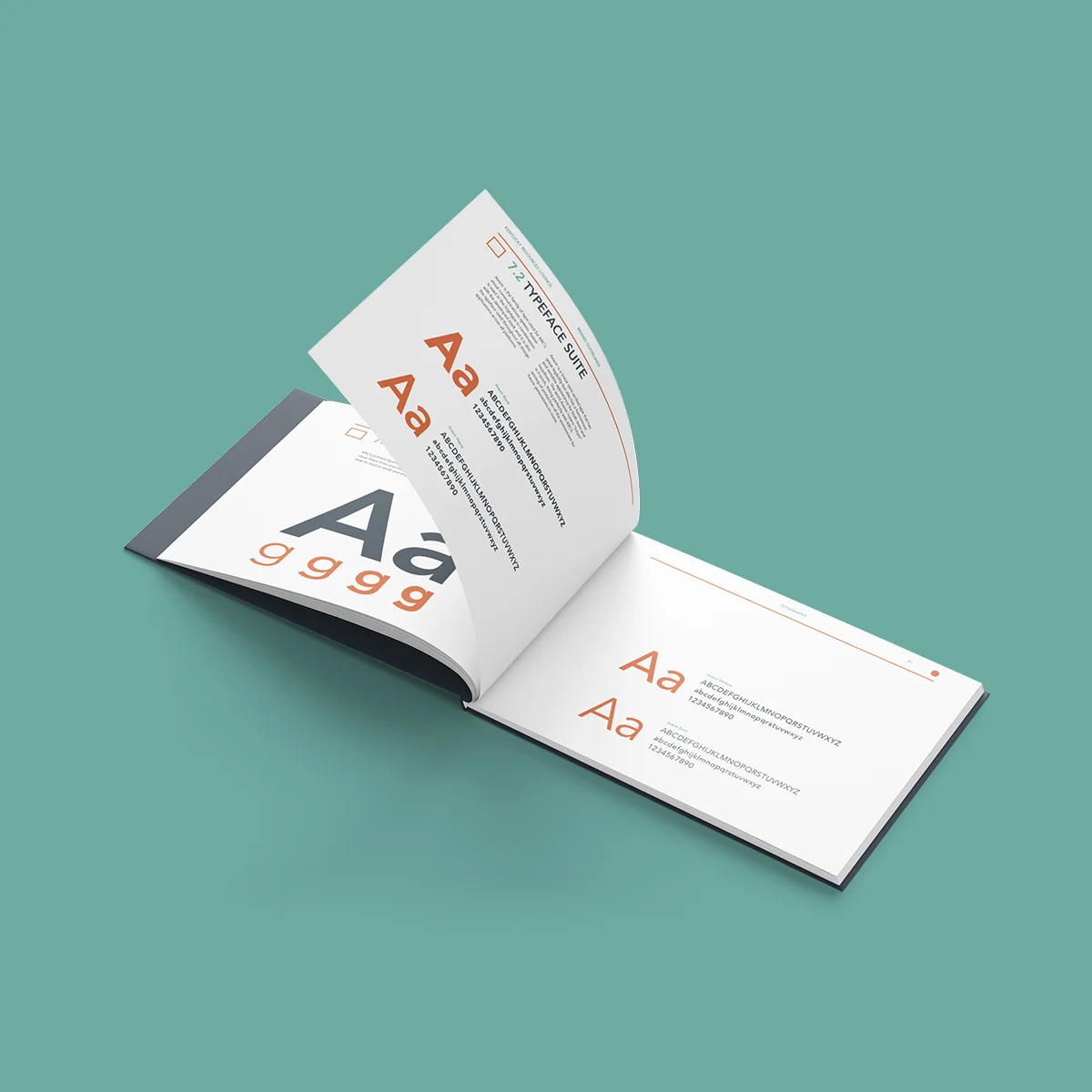
After creating the logo, and other brand materials, we were given the task of creating a brand guidelines book, which brought all these assets together. For this task, I was given the responsibility to oversee its creation. By working alongside my teammates and collaborating with them, we were able to create the rules and misuses for the KRC brand identity.