Student work
– GEMBA
This is a project that started from my passion for being active. I wanted to create a company that focused more on the experiences people will have. By doing this, it gave me the idea to design a company that strives to create reliable products that the consumer won't have to worry about; letting them focus more on their adventures and experiences.
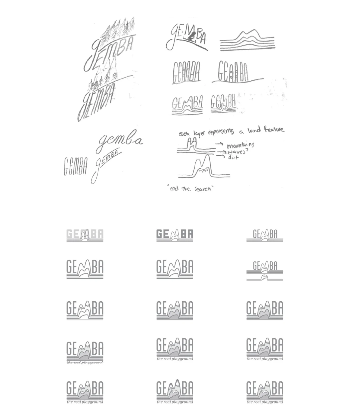
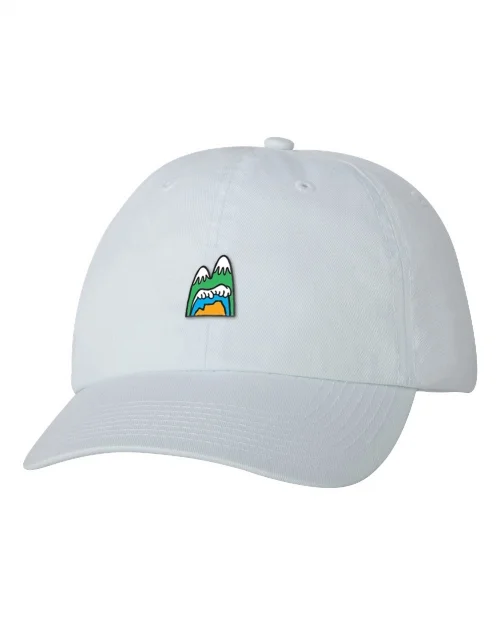
CREATING A BRAND LOGO
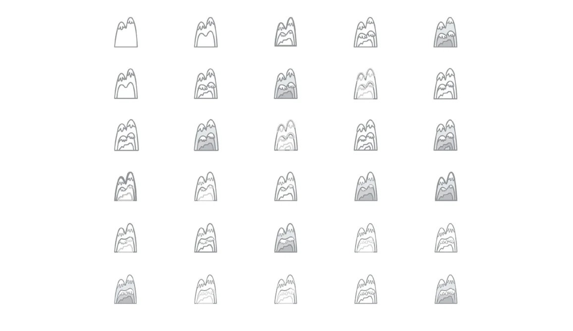
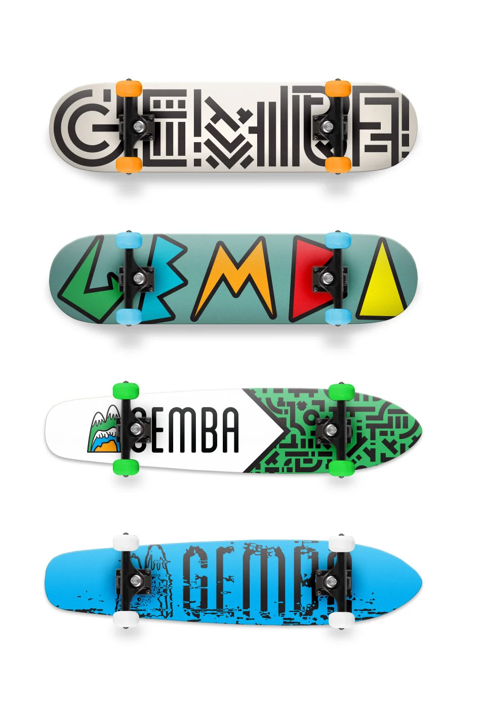
The Gemba logo represents adventure and nature across the three main terrains: mountains, water, and desert. The Word Mark, Gemba, represents the "real-place," which comes from Japanese origin. Meaning that adventurers' "real-place" is where they strive to be; whether that is the mountains snowboarding, in the water surfing, or the desert trail riding.
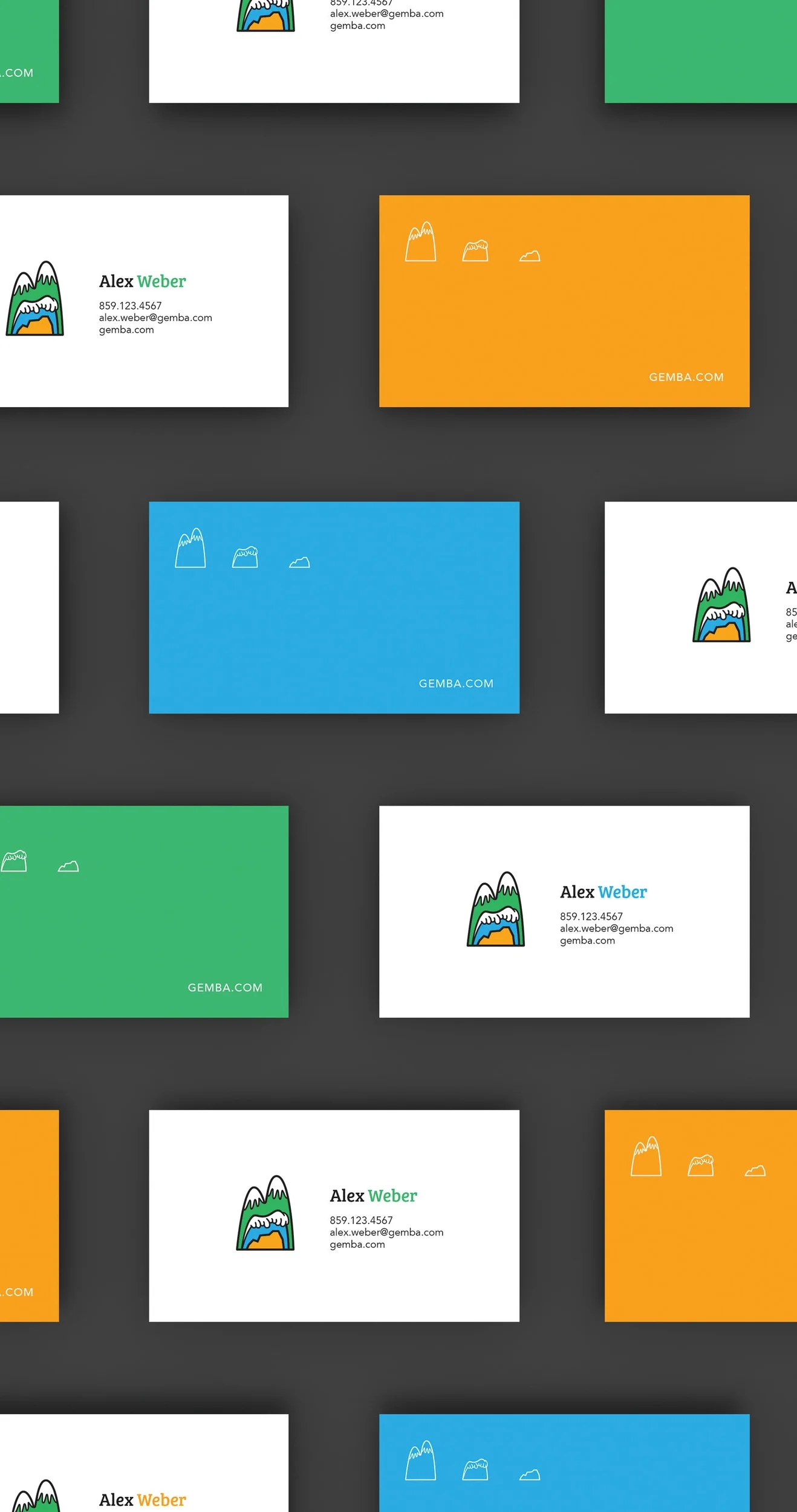
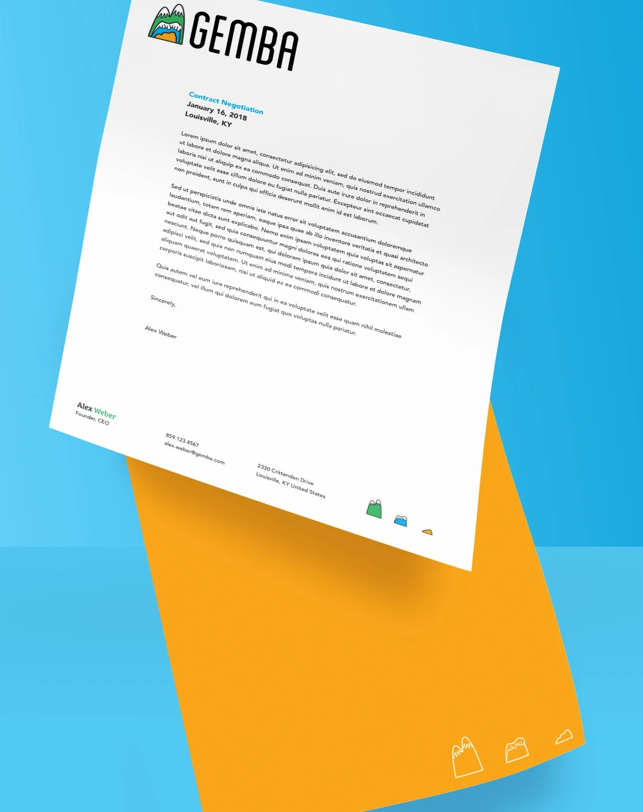
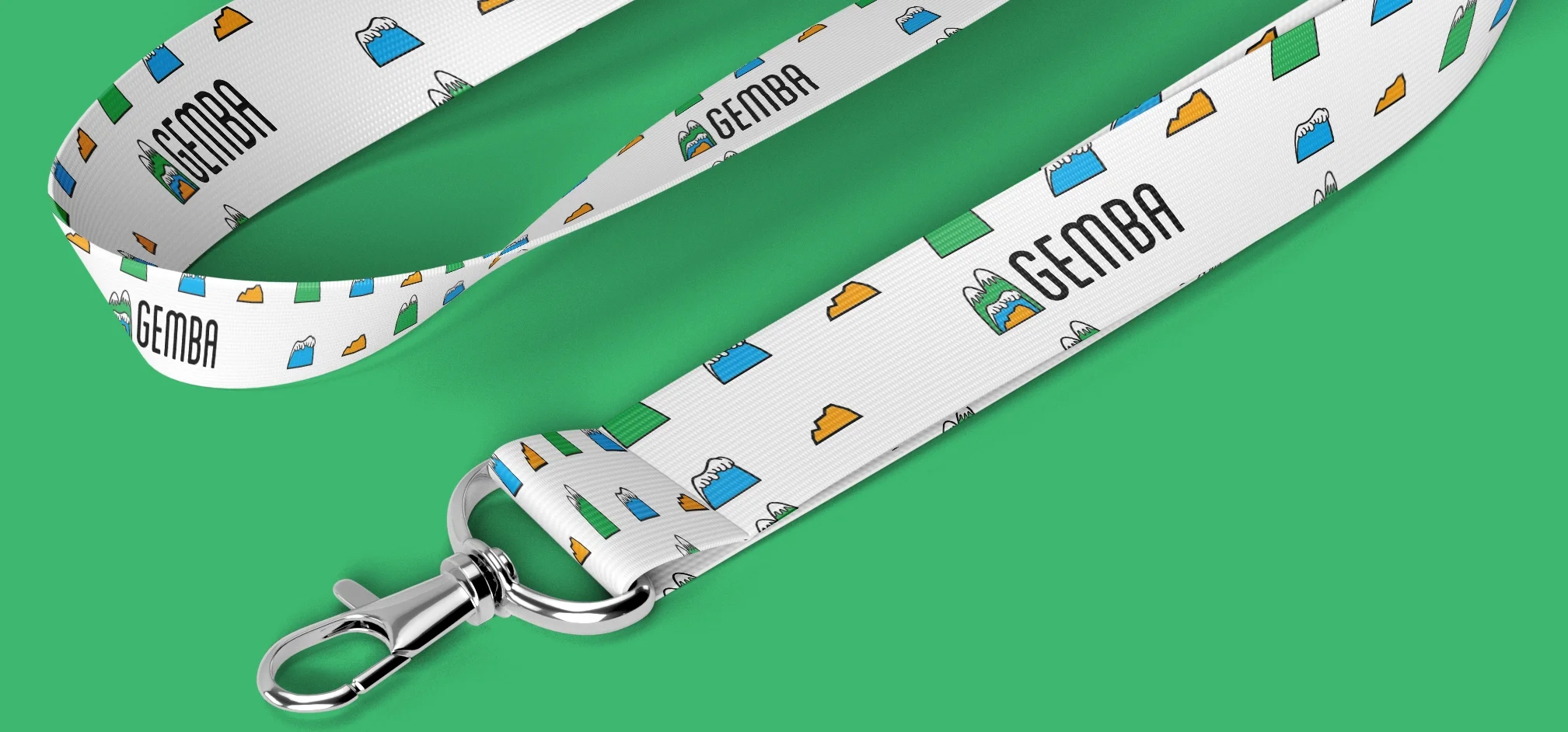
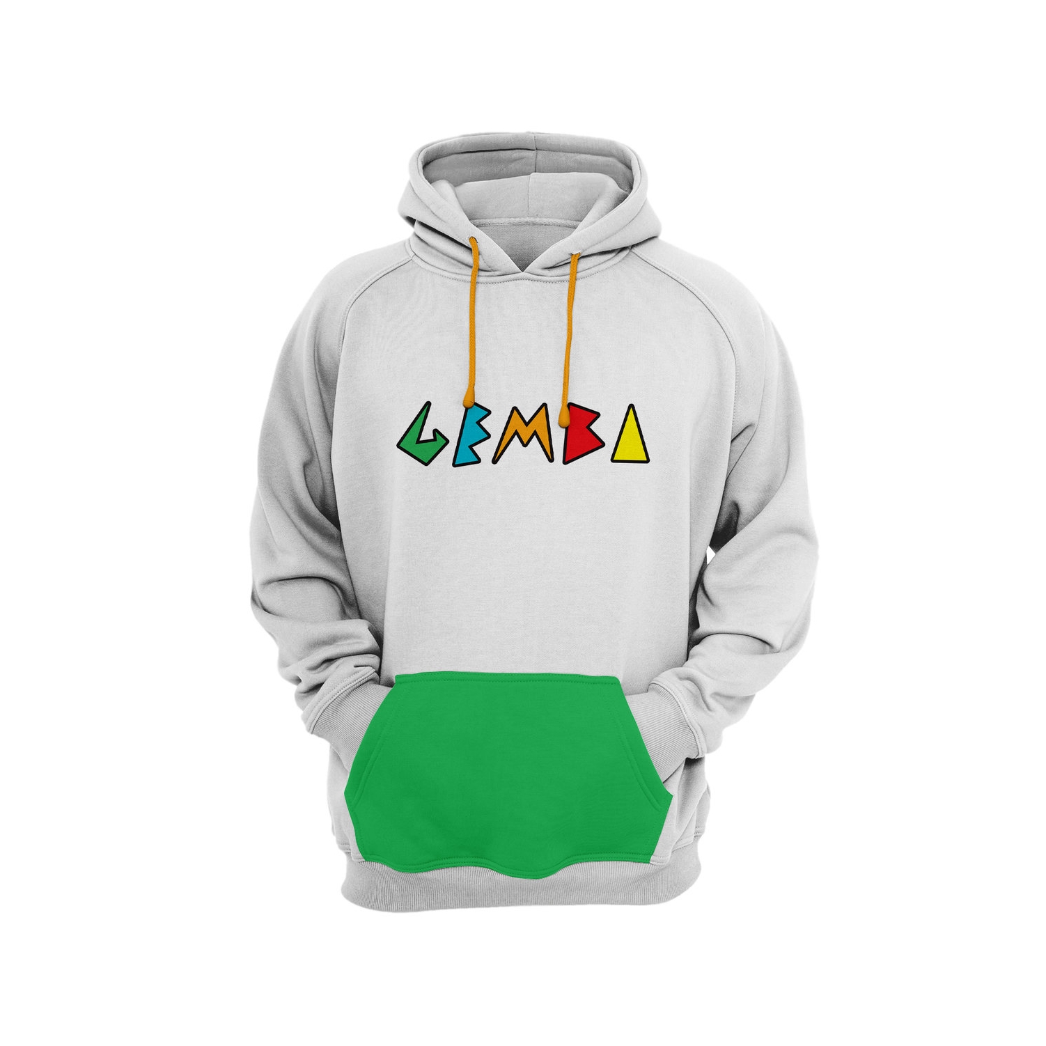
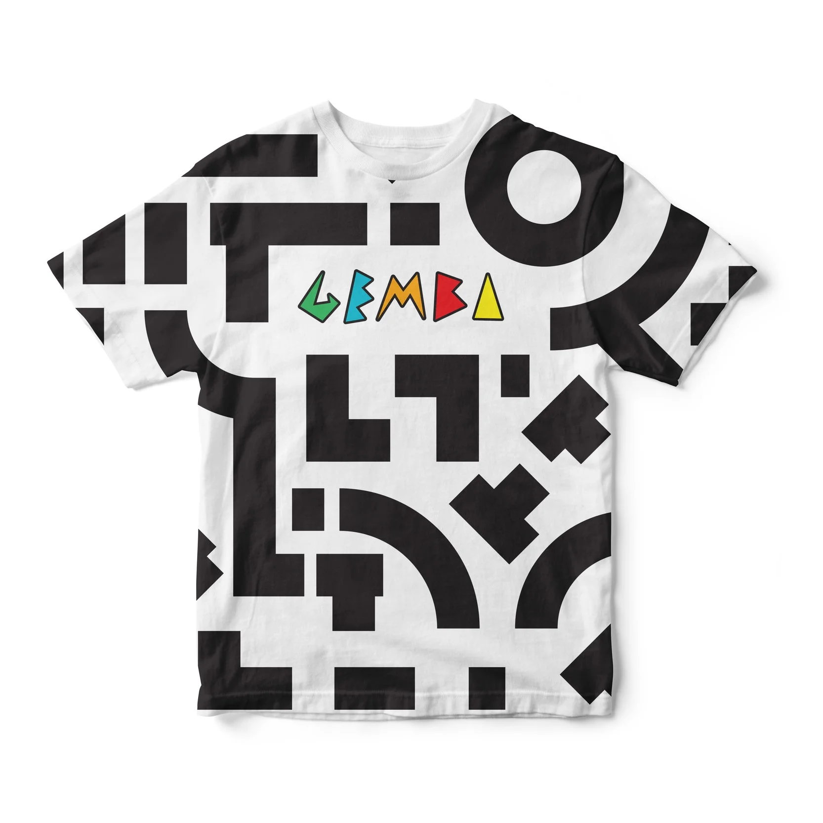
COHESIVE IDENTITY
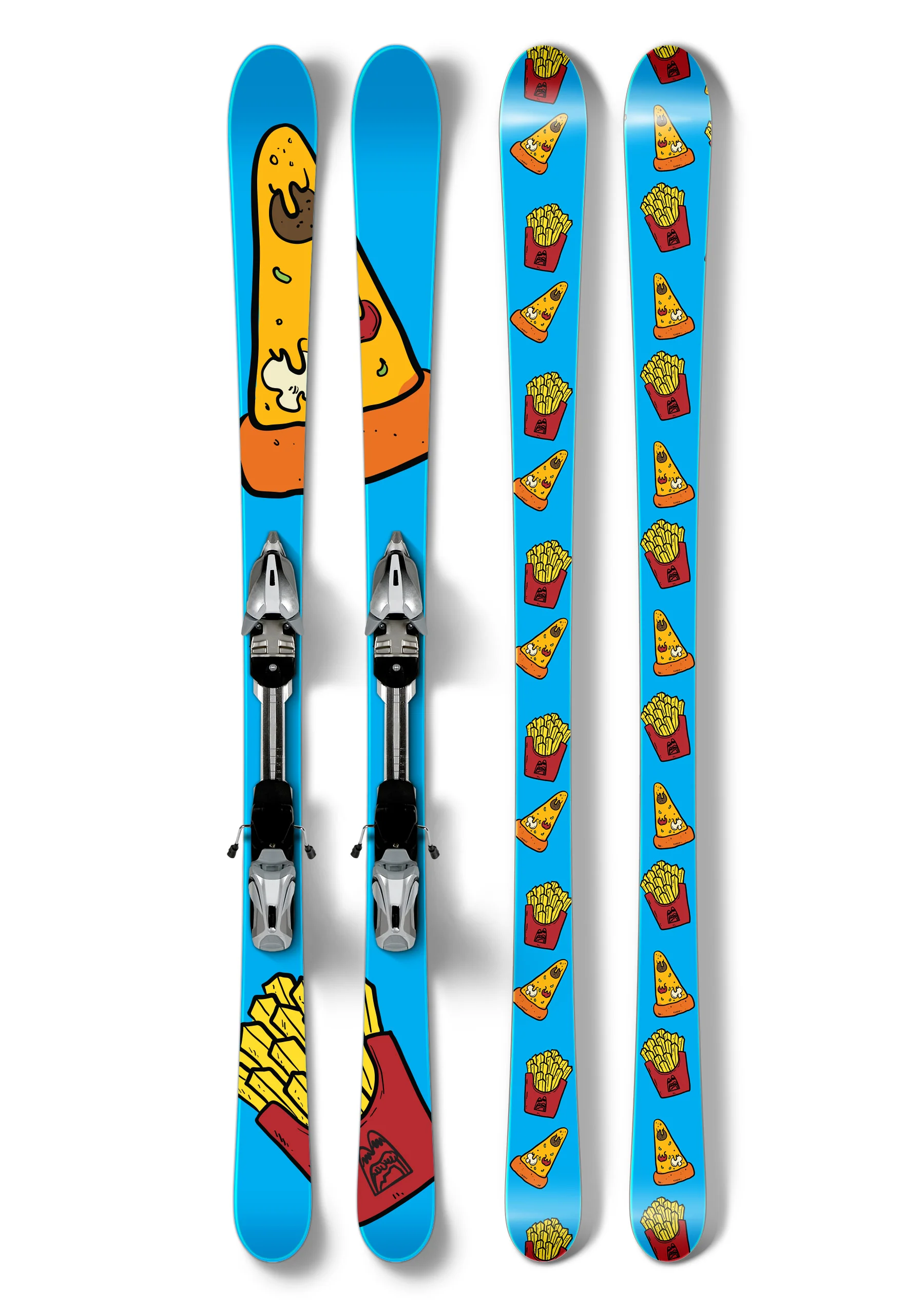
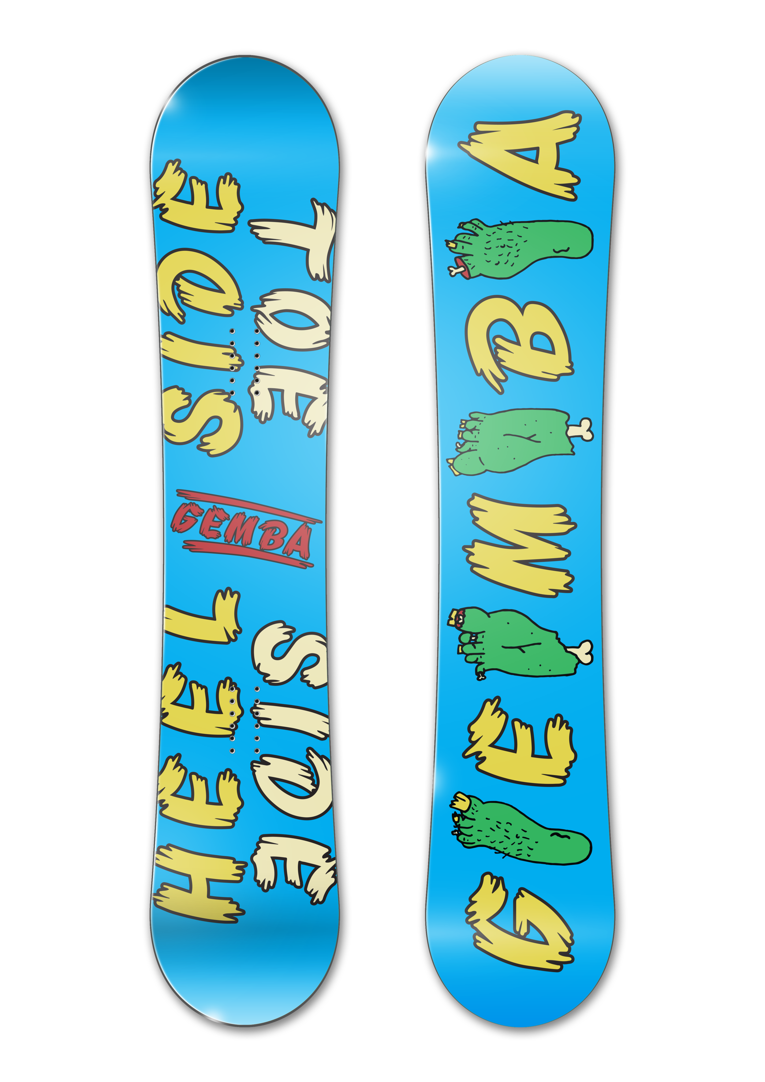
When creating any company it is paramount that the brand identity is recognized across all aspects. When creating the Gemba brand, I made sure that color was the main focus. By implementing the bold colors alongside the logo, it helped reinforce what the brand was. This is what became the focus for the visual identity across the Gemba platform.
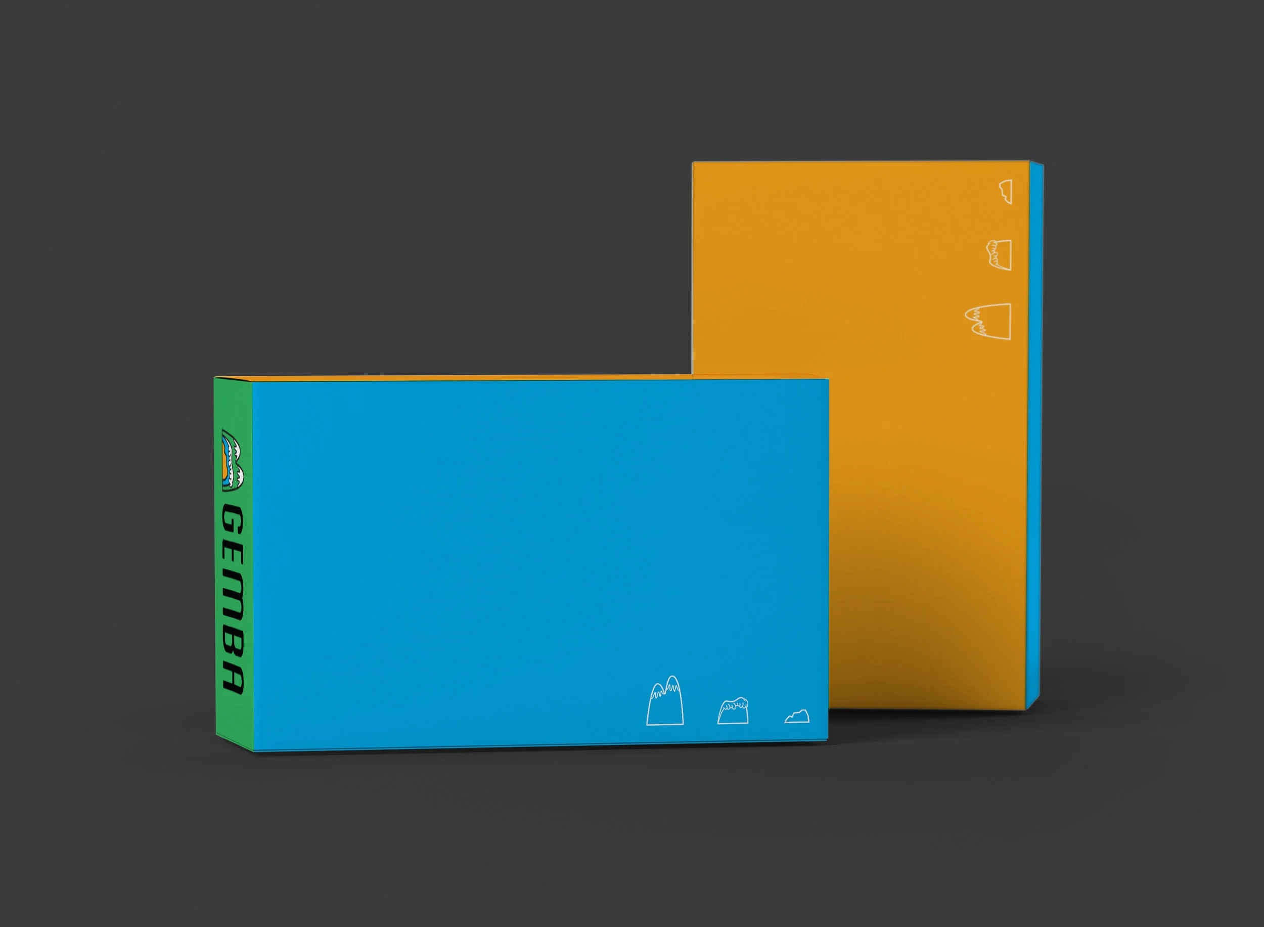
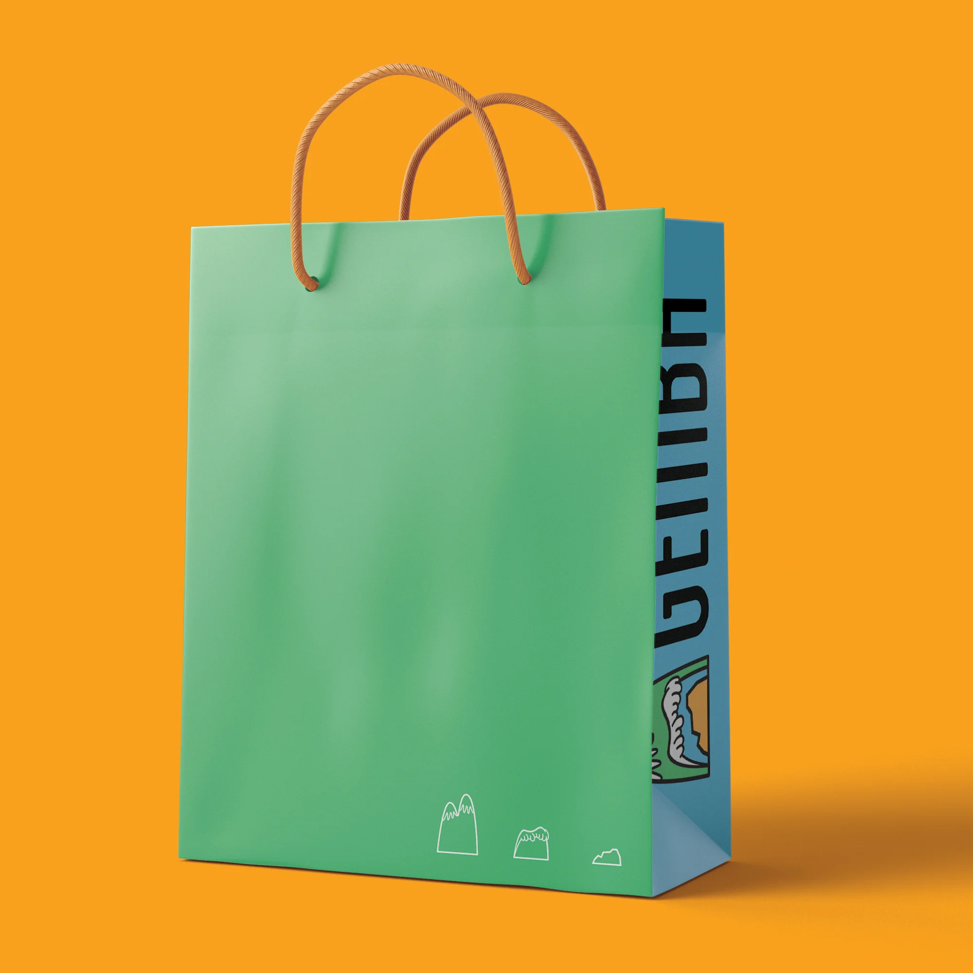
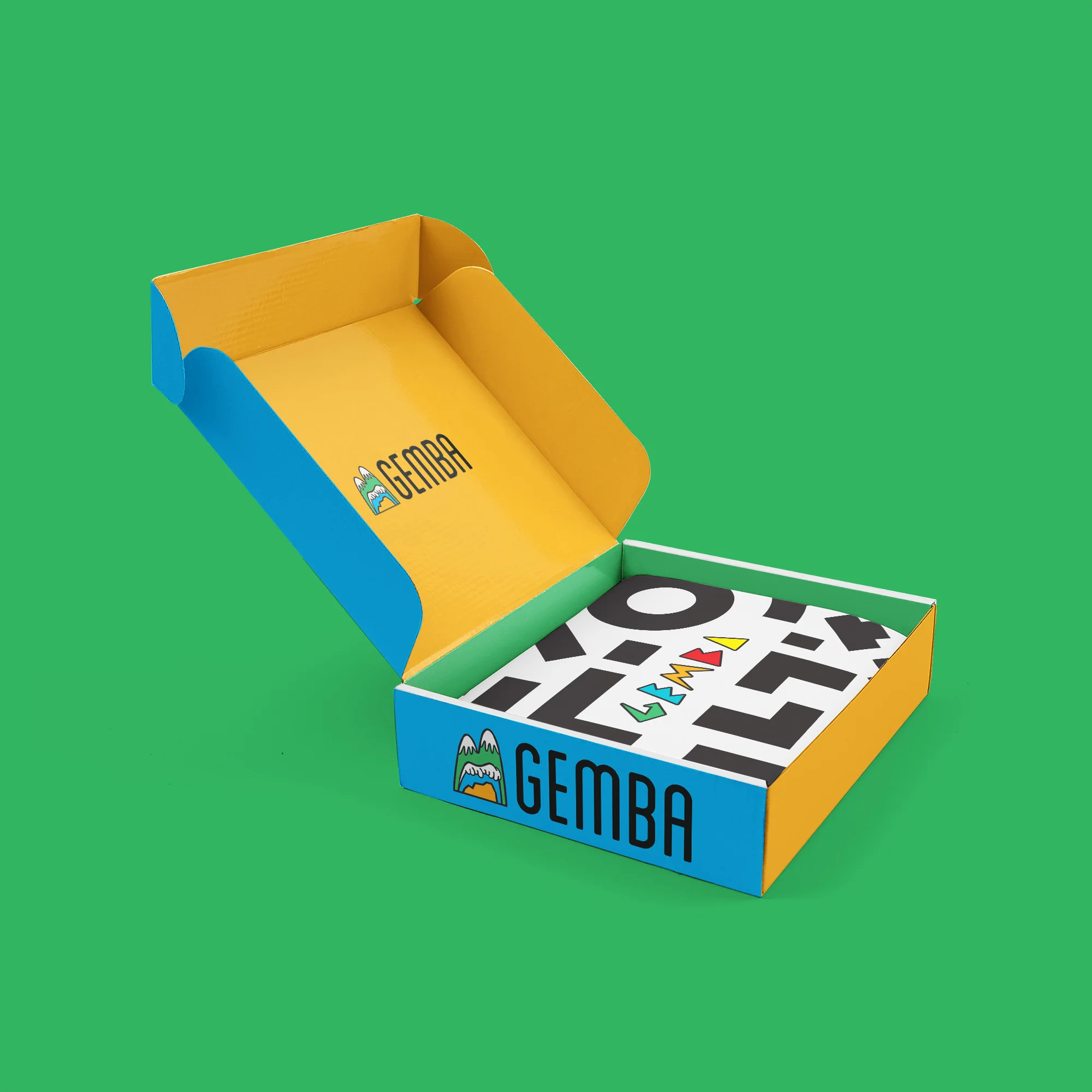
PACKAGING Design
Packaging has become such a huge part of buying goods, that it is almost always expected for a company to give the consumer a presentation. Gemba does exactly that. With the packaging, I made sure that the colors popped, brand identity was visible, and everything else that isn't necessary wasn't on the box and bags.
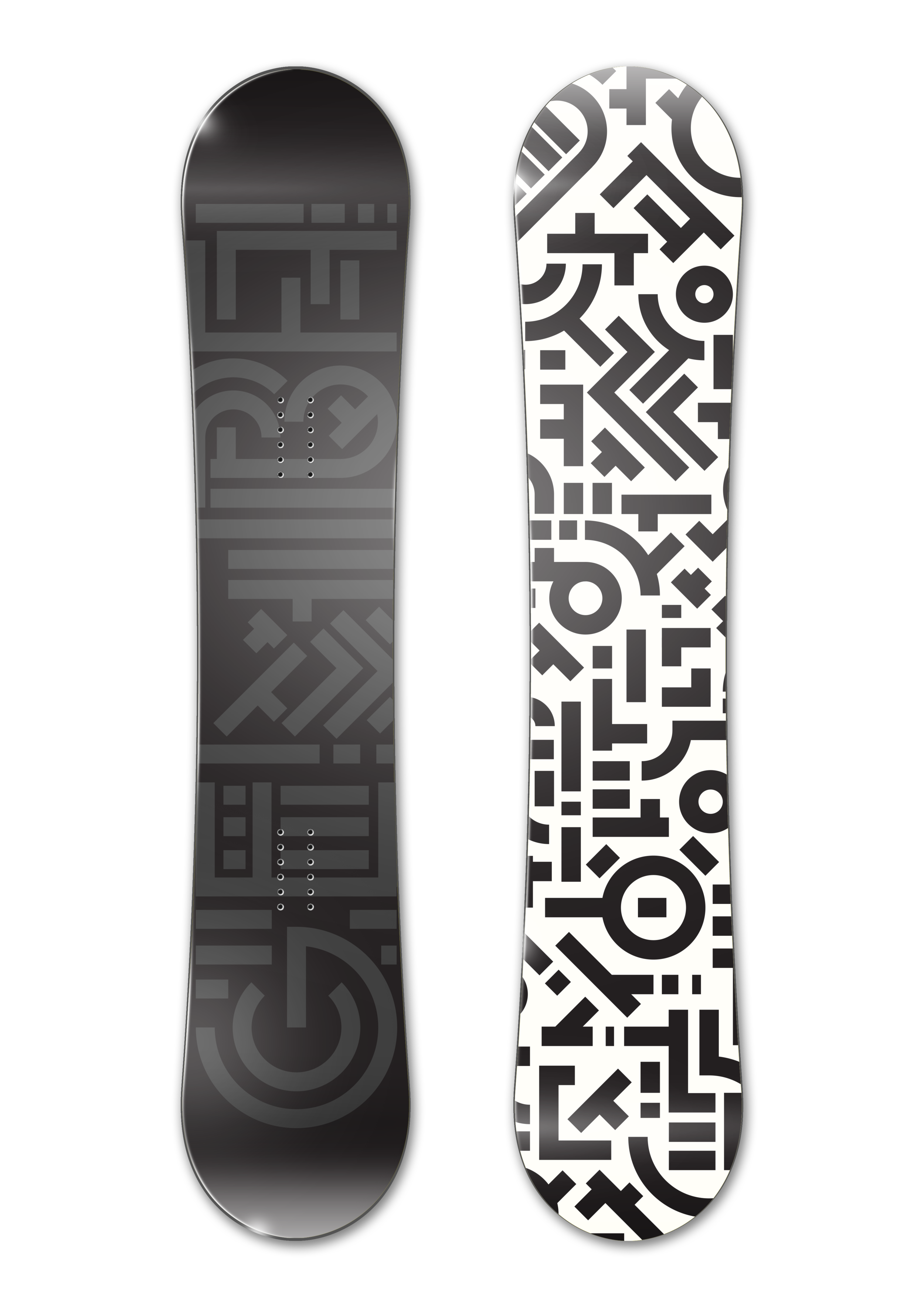
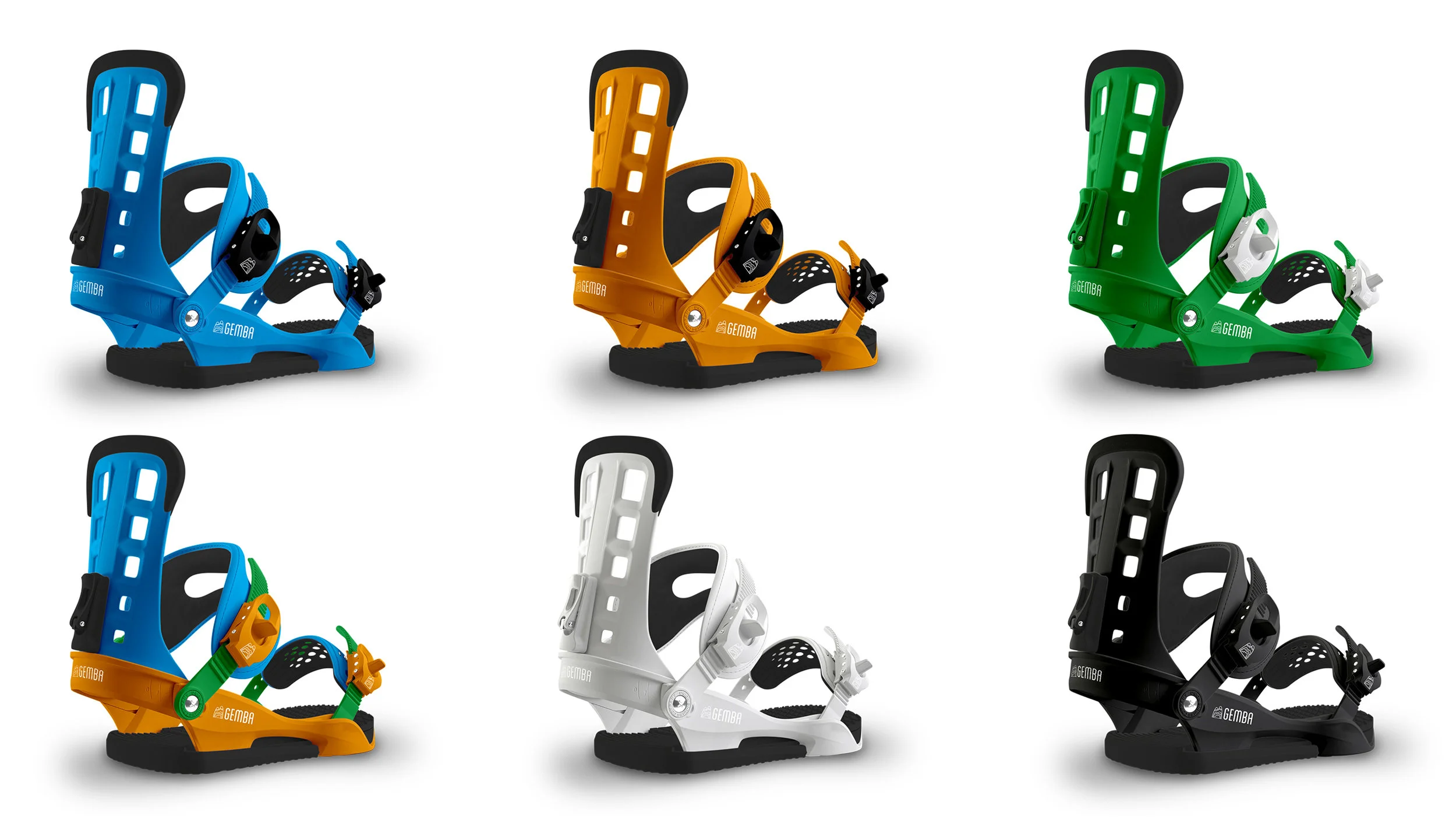
PRODUCTS that last
Gemba's main vision is to make sure that their consumers are experiencing their adventures rather than worry about their gear. With Gemba this starts with making quality goods, and by backing them with warranties that will surprise you. This is the way buying products should always be.